Extra Pages

Showing posts with label good color. Show all posts

Monday, November 20, 2017

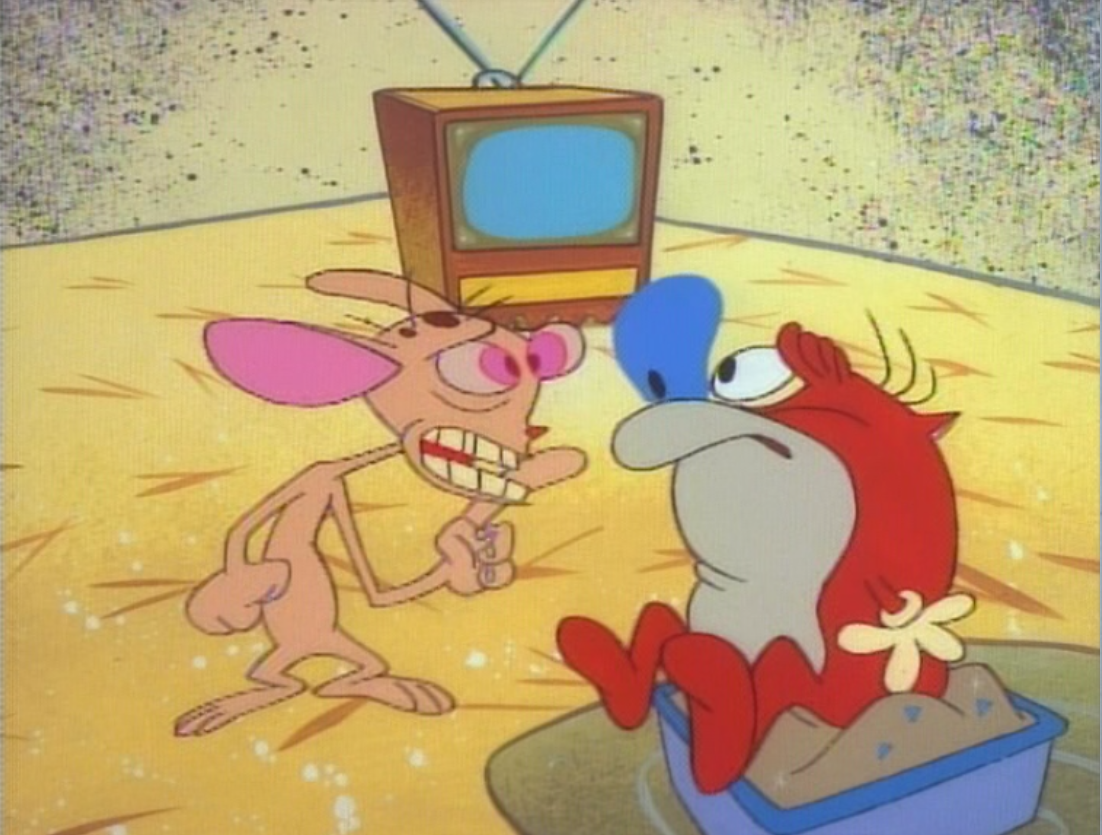
Weird, primitive drawings in the first Ren and Stimpy cartoons

It's been a couple of weeks since I've posted, and I'd like to apologize for that. Hopefully, this should make up for all the time I've been gone.

I've been watching a lot of The Ren & Stimpy Show after finishing The Hep Cat, and I came to realize that the first four or so cartoons in the series are... pretty slip-shod. A lot of the drawings are primitive and loose, and that is what I plan to showcase today.

Not that these cartoons are bad; I really like them! But I just can't look at them the same way I did before.

You can tell that this is an early Ren and Stimpy just from the color styling. It's a lot more neutral here than it came to be later in the rest of the run. The characters are also drawn very simply; there aren't as many planes and shapes holding the characters together than the end of this first season.
There were also a lot of funny-looking drawings, just for the sake of being strange. I'm glad they fixed this later (and it's too bad that Games reverted to these out-of-context weird drawings when they took over the show).
Ren really looks weird here, doesn't he? His construction isnt as nice and solid as it got a little later, and he looks really flat. Not a whole lot of appeal. Then again, he looked okay in Big House Blues, so maybe some of the overseas studios can take the blame for a lot of these bad drawings. Who knows?
Toes!

Very simple staging here too. Everything's in the center of the screen, which tends to be a thing a lot of beginners do, myself included.
I really like how this looks though. Varied composition and really cool colors!

I actually really dig this drawing. It's funny to see this early side view of Stimpy!

Weird eye wrinkles, but I actually like these too.

This expression is kind of odd, though. It just seems to float. Nothing is keeping these features in place.


John K. went on a lot about there being an "Insect Ren," but I would like to refer to this as "Bird Ren." Check out that mouth (or beak, rather)!

What do you think? I'll be posting more of these caps soon enough, so stay tuned! (On another note, I can't stand these awful "remasters" of the Ren and Stimpy cartoons. They're so disgusting!)


Monday, November 6, 2017

The Hep Cat [part five]: Excellent backgrounds again, and the closing!

It looks like we'll wrap this up here right quick! The end of the cartoon comes in this post.
Some of this vibrating drybrush is pretty great. I open these posts a lot with these, don't I? I'll deliberately not start these this way in the future.


I didn't realize how many throw-away backgrounds there are in this cartoon, especially this late into it. Some of them last for a fraction of a fraction of a second, but they're golden! I got a few in here if you want to admire them in your sleep like I do.

More Clampett shadows. He uses these more than the other directors from what I've seen. They're really good at conveying action!


Heaven for your eyes, especially that top painting. Who the hell could paint like this now? I know I'd like to!

This is a different effect, but I really like it! Soft blending of colors for a motion blur looks surprisingly good here!


Oh God.

Is this where body pillows came from? Is this entire farce Clampett's fault?

"I can dream, can't I?" Words of a true fanatic.

If so, then this is a really good anime.

And that's the end of the picture! Not a whole lot to talk about in terms of story structure here since it is mostly slapstick, but it's decent enough! I might revisit some of this stuff later when I get the chance.

I think I'll post some one-off articles on other studios later (I have a good one about Fleischer if you like innovative motion picture technology!). What cartoon should I pick apart next, though?

Cheers!

Monday, October 30, 2017

The Hep Cat [part four]: Something new has been added!

Jesus Christ, I've been gone awhile, haven't I? Many apologies for the absence. Things have been nuts but have, thankfully, settled down a lot. Let's just see how long it lasts.

For now, it's time for some more Hep Cat, with a tall-ass glass of root beer and plain popcorn, just the way I like it! What's Clampett got for us today?


You're on to something there!


Great drawings. I especially love these circular pupils; they really drive home his surprise! The backgrounds, as usual, art astonishing. Something I just noticed: on this last painting, the sky gets darker as your eye moves to the right, but you would never see it if you were just watching this film casually.


Of course, he isn't inclined to give a damn when the action's this good. I can't say I blame him.


Don't you hate it when this happens?


Pay close attention to these next few screencaps. This is a basic setup for a take, for anybody interested in animating someday, like I am.

STEP ONE: realization

A take is a reaction to something, usually something bizarre. (Unless it's a shrink-take, which can be used more liberally.)
STEP TWO: the actual take

Now the cat realized he was making out with the dog. He reacts in panic.
This last part here is really just an add-on. A reaction to a reaction, if you will.
It's a fun idea regardless!


"Are you following me?" seems to be a very common Clampett gag. It's funny, but I figured I'd point it out. Besides, that dust drybrushing is very good, so now I have an excuse to point it out.

This is the same background! It's a vertical pan, and beautifully done. I wonder how many background painters in the business could pull something off like that today? It'd be a marvel to see.
This barrel scene is really pretty too. A lot of really lovely lighting effects. I dig it!


At this point, the cartoon is all about the gags. I'll share a few caps here and finish this thing off in the next post!


See you then! In the meantime, look at these backgrounds. I don't know if I told you whether I liked them or not. Besides, I'm out of root beer.